Wednesday 16 August 2017

Profile of a young architect

I speak with Stephanie Tham, whose work stood out at the recent RCA graduate show. We discuss – among other things – conservation, the role of the creator in a consumerist society, and the surprising crossovers between architecture and competitive cheerleading.

I went to the Royal College of Art's architecture school postgraduate show last month. It was great! I was super impressed by the energy and creativity on display.

But given that I had hoped to learn something about the perspective of these architects-in-training it was unfortunate that none of them were around to talk to when I was there. Afterwards, though, it occurred I could simply get in touch with one of them and see if they would have a chat with me. So I sent an email to Stephanie Tham, whose project, as I wrote, I thought was particularly compelling.

Tham replied and generously agreed to meet. Bravely, perhaps, too. At one point in our meeting she refers to my mean mockery of the awkward prose in some of the other students' blurbs (in fairness, I was more positive about their actual designs!): “I saw what you wrote about my classmates and I was like, Shit! … Oh my god, what am I getting myself into? Then I read it, and I was like, Oh! He liked it.

We do the interview at a pub near Victoria station. It goes really well. Tham speaks with energy, in an engagingly direct, informal way. She is also driven, though. The novice interviewer's fear that the subject will clam up or be confounded by certain questions never comes to pass: she has a thoughtful, mature take on all of the topics that we cover. She speaks quickly. It feels a lot of the time that she is a step ahead of me. The opening of the interview is a case in point. I suggest we start by talking about her project itself and I begin tapping at my smartphone to get to the pictures I took at the show; she already has her phone out. “Ah, you mean these?”. Of course, her pictures are much better and we work from those instead.

The project


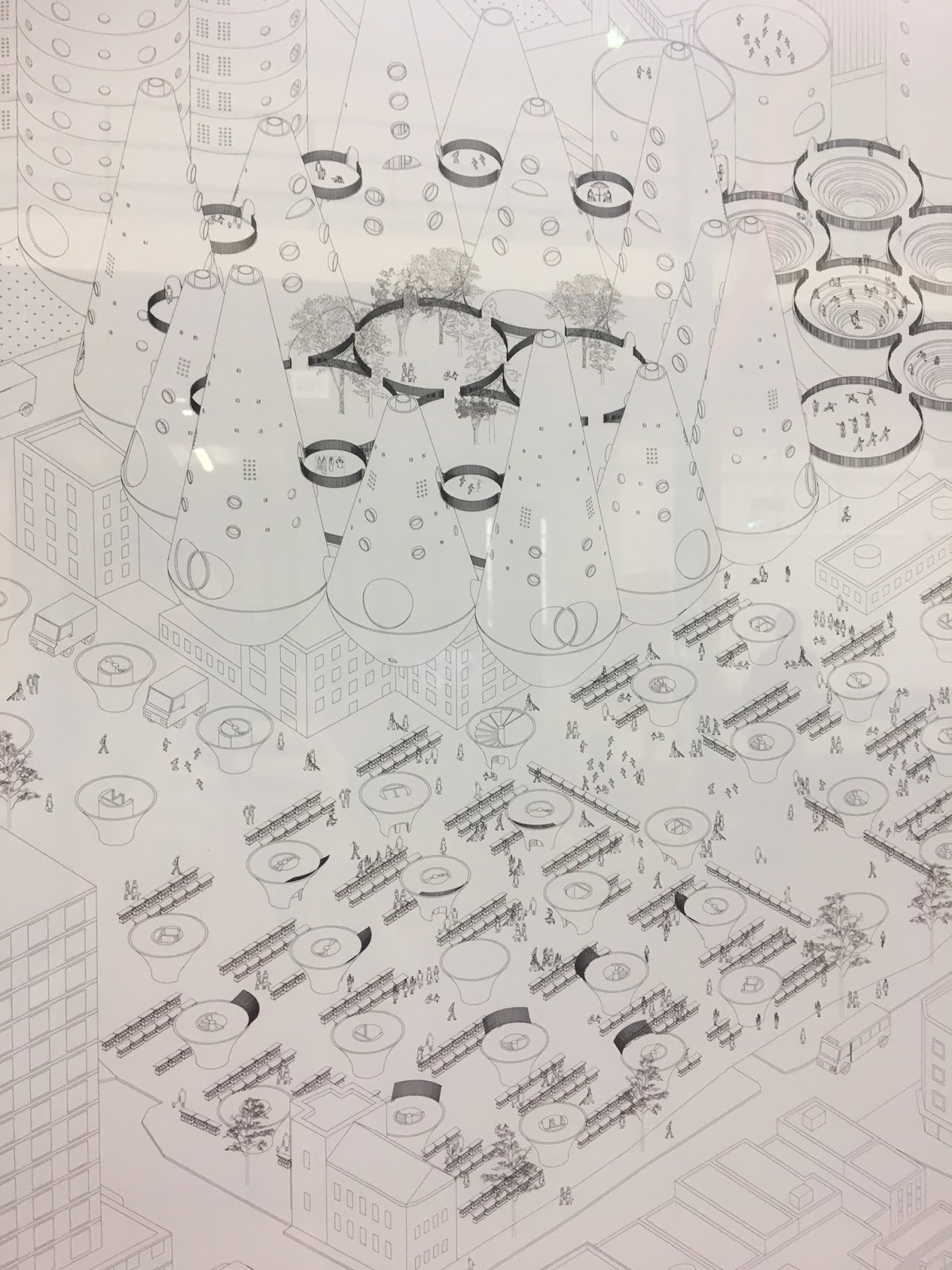
I mention that what originally caught my eye were the render drawings. These are unusual. 

from https://www.instagram.com/stephbysteph_____/


If you look at a lot of architects' renders (i.e images of what the finished thing will look like) you notice that they are almost invariably done from a perspective located some physical distance from the building itself – so you are looking at, if not the whole thing, an entire elevation or facade. It is as if the architect is announcing 'behold: this is my work!' 

Tham's images are quite different. They are like a set of candid camera pictures: architecture caught in the act. The perspective is that of someone inside the design. Each image is from a window, walkway or balcony, or half-way up a staircase. There are tantalising glimpses of other parts of the development from odd angles. It's very engaging because, as the viewer, you are immediately immersed. You can imagine yourself there.


Was she conscious of breaking the mould in terms of how her designs are presented? She was, but this wasn't necessarily something she set out to achieve from the start. “Do you want me to start from the beginning of how I got to the end?”, she asks. Yes.

She explains that the site is a real one, on Leinster Gardens, Bayswater. She was looking at building on “impossible sites”, and her tutor gave her a tip-off about the existence of this one. It is a fascinating story in itself. It is a exposed gap over what is now the District/Circle line between Bayswater station and Paddington, created when the cut-and-cover line was built in the 1860's to allow steam venting from the original steam railway. Since the gap was in the middle of the terrace, a false facade was built across the No's 23 and 24, complete with fully formed neoclassical doors and pedimented windows. She had a hard time finding the location: “you don't even see the false facade there, because it just looks so real”, she says with wonder.


She was conscious of how typical developers think and of how soulless the results typically are. Her whole approach was a reaction against this. “They want to build on land that you can build tens of units on that are so tall… one bedroom, two bedrooms, everyone is living the same way. I didn't want to do that … I wanted to cater for people who are individual and different in terms of how they use the space or how they want to live.

When I started designing the individual units, I tried to stack them up to create these kind of spaces to fit in the site, which was really small. … And basically what I planned to do was take everything out and build my own foundation at the bottom, stack everything up, and then in the end have a structure that pushes everything back again.

Each of the apartments is a unique shape: a tube, a wedge, a triangular prism, a half-arch and so on. Tham shows off their particular qualities in a series of series of framed drawings of the individual units, each with its own whimsical inscription, “For the Acrobat who trapezes 24/7”, “For the Architect who is tired of walls in his home so he decided to live in a cylinder”, etc. 


The focus is on cosy, individuated spaces. Although offbeat in terms of mainstream residential architecture, Tham's approach is in line with a current fascination, outside of the profession, with huts, sheds, re-purposing of utility vehicles, glamping – with small, personalised, semi-architectural, spaces in general (think George Clarke's Amazing Spaces, or, uhm, more notoriously, David Cameron's luxury writing shed). She comments: “I had a little study on how big a space is needed if you stretch out your arms or you do whatever exercise.” To swing a cat? “Yeah! And from that I designed the bare minimum space that they needed – so it's comfortable for one person, but it's not too big. That's why I designed really, really small.” She studied how to stack up her units to create the most interesting, pleasant space. “I have had multiple arrangements of it.... how to build a courtyard in the middle, how to have three blocks instead, or whatever.”


Given the nature of the design, the overall shape isn't really the emphasis. As she says the configuration in the drawings/models represents one of many possible arrangements. It resists resolving into a single, brand-worthy, nickname-able outline (as with the Walkie Talkie, the Shard, etc etc). It is an aesthetic that aims to be picturesque as opposed to iconic, and in my book that's a very good thing.

Hence the unusual from-within perspective of the renders. “If you look at this series of images, it's captured in a way so you see what you need to see, and that's it. It's exterior, interior. This is in-to-out, and this is out-to-in. So it is basically looking two ways, instead of having everything shown in one picture, which I don't like. That's what this series was doing. It's all looking here and there, here and there.

Something I hadn't noticed before was that the renders were all arranged in pairs. That is, every image from inside one of the apartments is matched with one looking back at the same spot from the courtyard. This represents such a simple yet effective manoeuvre that it is a wonder it isn't standard practice. It seems the obvious thing to do. Tham points out: “It isn't obvious until you say it! And I didn't even know that I was doing it until my tutor was arranging it side by side, and I was like: wait a second, something is going on here that I didn't know about!


Another arresting aspect is the set of incidental, non-architectural elements that are included: mops propped up against walls, copious amounts of washing hung from railings. There are lots of cats too, wandering into frame as if photobombing the architect's vision. This sort of whimsically offered, yet realistic, element engages the viewer and humanises the whole thing. It's another instance where you think: why don't all architects do it like this?


I tell Tham that I like the cats. She points out that there is also a golden snitch in every image. A what? She explains the Harry Potter reference (it's one of the balls in Quidditch apparently) and shows me the tiny Where's Wally-style element tucked away in the pictures. 


I confess I never was a Potter fan: slightly too old when it first came out, maybe. “No one is too old for it!” she laughs. 

It's fine!” she continues. “I wanted to be mischievous about my project. I already had the cats... and I wanted to see if people pay attention to my drawings. So I've added a snitch into every one of them! So far everyone has seen it, so it is good. But I've been questioned: why did you put it there? I was like: well, you saw it, right? It's a matter of whether you actually see my drawings properly or not.

That explanation is, I think, is super interesting. It might be key to appreciating why Tham's approach stands apart. As she says, she wants to see if people are paying attention to her work. In other words, she doesn't take it for granted that others will engage with what she does, yet cares deeply that they in fact do. On the evidence of what numbers of other architects produce, and how they talk about their work, this is, strangely enough, an uncommon attitude. One gets the impression often that they aim to communicate not with any actual, individuated human mind but with a sort of disembodied intellectual aether – with, as it were, the Ages, or with the gods perhaps. Whether or not a particular shape or curve is intelligible (let alone pleasing) to anyone else is seemingly a matter of indifference; what appears to matter instead are grandiose abstractions such as Purity, Honesty, Dialectics, mysterious Essential Qualities, etc.

Tham, by contrast, evidently does think it matters whether others can make sense of what she does. And she intuitively understands the fact – a counter-intuitive fact, perhaps – that a good way of encouraging such engagement is to play games, to tantalise, to be deceptive even.

Writing about this elsewhere I've illustrated the point with a Bill Hicks put-down in which he tells his audience that they are responding to his gags “like a dog that's been shown a card trick”. The cruelty, yet almost philosophical brilliance, of the line hinges on the way it draws attention to a whole domain of stupidity, of slack-jawed disengagement, beyond that of being a fool. To be duped one must have some apprehension of what is going on. A dog looking at a man shuffling and dealing cards doesn't have any relevant apprehension. It hasn't formed a mistaken view about where the ten of diamonds now is, rather, it hasn't formed any view at all. The dog is not a dupe – it's too dumb for that

Hence it is actually something of a complement to the audience if they are led up the garden path. Such manipulation presupposes an understanding to begin with; it requires that the author/performer/architect makes some effort to be meaningful or intelligible. There is a lot of architecture out there that seems, conversely, to be purpose-built for the proverbial card-watching dog. Dull repetition or tedium-inducing arbitrariness implies total indifference to the mind of the viewer. In such cases, one is treated like a dog. I decide not to bring up the analogy, though, with my interviewee: as we will see, she is a big dog-lover...

I do bring up one other aspect of the work that I liked: a series of drawings showing the construction process, namely parts of the building being lowered by cranes into place, as in a game of Tetris. (Even better, I've since discovered the video of this, below.)


Tham explains, self-deprecatingly, that this came about “because my project was too fun”.

I wanted it to be pink and not white or what everyone else in school was doing. ... My tutor asked me 'why is it pink?' and I just answered 'because it is fun!'. Because sometimes I just don't have answers to those questions. And he was like yeah, there you go. Just do it like that and stop worrying so much, you know?

Because [I was worried] it was too fun, and too cute and too playful, my tutors were like, why don't you try and see how it works on site and try and find a construction methodology to make it more realistic? So I tried it, and it was a pain, but it worked. I had to research sizes in terms of how to transport them on a truck. The street is only lanes wide. … [The maximum size that could be transported] was about 2.5metres by 2.5metres and one unit was in the maximum about 9 metres, so I had to chop the biggest part in eights and I had to calculate the weight and how they would fit on the crane and everything else. It was a pain, but it was fun because I didn't know that it would be like that. I almost thought I would plonk it there and that would be it. But that's not going to work.

Would these things be something that, in practice, engineers or contractors would deal with, I ask? Tham explains that “because it is a design school they expect you to know everything. So you have to learn everything by yourself. … In real life engineers hate architects because we give them this kind of design and expect them to deal with it – you can see that right? It's hard!

Some students were exhibiting far more outlandish projects: floating islands, artificial suns. Was she tempted to do something like that? “Those are fun to think of and in school it's fine. But in the end it's a pretty project, and all in all it's a pretty thing to see... but I don't know... I've always had to bring my projects back down to the ground. This was going to be too playful until I had that axonometric drawing of the construction.

The making of an architect


Tham had quite an international upbringing. In fact, she is, to adapt a phrase used by Malcolm Gladwell (to describe himself, as the Canadian son of English and Jamaican parents) something of Commonwealth child. She was born in Canada, grew up in Malaysia, went to university in Australia and then moved over to the London for her Masters.

From https://www.rca.ac.uk/students/stephanie-tham/
Surprisingly for someone with such obvious aesthetic gifts, she hasn't always wanted to be an architect. Her earliest ambition? To be a vet. She makes no secret of her love for animals. In her profile on the RCA website she describes herself as someone who 'prides herself on joyful architecture design and does backflips with her pet dog more frequently than not', and whose dream is 'to design a university for homeless dogs in Malaysia and guide them to become assistance dogs for those in need (or not).

But despite studying sciences all the way through school she tells me she eventually realised she was scared of blood and couldn't cope with “pets that are dying”. She doesn't like seeing animals suffer, I suggest? No, she agrees, “I like happy animals!

However, her father tried to dissuade her from architecture as his cousin was an architect and seemed to have work very hard for it. So she gave business school a try. After three months, she knew she had had enough (“I was like, I can't do this, I can't do this!”) and transferred to architecture. She hasn't looked back.

It's possible, though, that her less direct route has affected her mindset. “I think the way I see architecture is very different from some people … I don't like seeing things that are straight-to-the-point - that's my way of doing design, that's how I'm going to present to the world - and you expect everyone to understand your work. In terms of presenting it, architects are always in front of a computer. They don't talk to one another, asking what needs changed. So you are designing and you forget how to put it into words. It's hard to change to from what is in your head into plain words. It is quite difficult for some. For me it was quite difficult as well … I just had to figure it out.

The transition from sciences to architecture was tough, but Tham was motivated "because it was fun”. I comment at this point that I wish I had gone down a more 'fun' career path. Tham says “No no, please, trust me, don't!” Why?

A lot of my friends who are studying medicine or business, they come to exhibitions and they are like 'oh my god, this is so much fun!'. But they don't know how many hours you put in before your finals. You sleep for like 2 hours a night, for like a month. And you can't complain because that's what you have to do. And you think that your project is not done until you have to print it. So until the last day. Even if it is not done you have to say that it is done. There is no such thing as 'OK, today I'm going to finish this', because it's never going to be finished. ... The deadline is all that matters. Even if you try to finish a month in advance, you won't finish it a month in advance.

OK. Nonetheless, I comment, it is early days in your career and you are producing some pretty convincing work. And that is true of her classmates too: everyone at the show seemed to have serious talent.

She agrees with this last remark. “Yeah. It's a tough school... When I first went in, I was so scared, because I was the youngest in school. Everyone's been working for 5, 10 years. I was freaking out but in the end I just tried to be as good as I could. I tried to bring in a young person's perspective. ... They were about 28-30. Some of them were married, some of them had kids. And when I went I had just finished my degree. I was like 'I don't know what you are talking about!' …

It was very coherent in terms of how they presented as well, very professional. I just took my month's break travelling, playing with my dogs or whatever, and then I took a masters. It was a big plunge into this school. It was good. I mean like, if [I had a chance to] to do it differently I wouldn't go to any other school because I've heard about they do it in other schools, and it's more. ... This was self-taught.”

She did at least get some work experience during her BA, which she did at RMIT in Melbourne. In the long breaks between semesters – Australian universities apparently send you home for 3 months both in the summer and in the winter – she returned to Malaysia and interned at her friend's mothers' interior design firm. This mainly involved helping this “auntie” (in Malaysia older woman are all addressed as “auntie” she explains) learn to use design software, such as Rhinoceros, so as to be less reliant on draughtsmen. She enjoyed this, even though she wasn't doing the designing. She was also taken on site visits, learning something about the client-designer relationship in the process. There was one client who insisted that her boss install a 3.5 metre curtain rail “... which was ridiculous, but she had to do it because the client wanted it.

Tham evidently doesn't regard interior design as somehow lesser than architecture. “I've always liked interior design: in terms of material, how you design and divide a space. I like playing with spaces.” I make a connection here back to what I saw at the RCA show. I say I was surprised at the scope of what the MA Interior Design students were doing: often remodeling whole buildings or even streets. It was on a larger scale than I was expecting. Tham agrees. “It's all architecture! Sometimes when I look at their projects I feel they do more architecture than we do, right?

Along with her dogs, something else she keeps up with when she returns home is competitive cheerleading. It is an interest mentioned in her RCA profile and she brings it up now unprompted. She has been part of a competitive team since high school and has coached school kids when back in Malaysia during the uni breaks. It is another delightfully incongruous fact about her. Architects have a reputation as being lone wolfs, as bloody-minded creatives (and indeed, I think, in the nicest possible way, Tham is in this sense quite bloody-minded about her work). I would think of cheerleading, by contrast, as the ultimate team enterprise.

But she sees a surprising link between the two: “I think what architecture and cheerleading have in common is how you stack things up and change the configuration on the mat in terms of performing. So that's why it was so interesting to me. If I am coaching the kids, I have to plan out where everyone goes and how you dance and how you make the pyramid and stuff. It's kind of like architecture, it's kind of the same.” She shows me a video of her team performing at a competition. I hadn't appreciated that at the level she does it, it is, in effect, a choreographed gymnastic sport, with jumps, stunts and, above all, all sorts of human pyramid-building. I can kind of see what she means.

Culture & conservation


I ask whether she thinks that living in different places – Malaysia, Australia and the UK – has influenced her outlook in any way?

I have friends who have studied in Malaysia and who have never been overseas for a bachelor or a masters. ... From what I have seen from my friends who have studied overseas, I think sometimes when we examine we are more open and we are more into testing different things instead of copying things every day. So you will design differently and try to bring that design into your home country to see if it works.” The irony is that despite living in a global society, despite living in an age in which there is unparalleled access to ideas and possibilities “we're all living in the same house, the same planning, the same this and that. We're all expected to have this amount of whatever there is in your house and you don't get to choose what you have.

Here another hint of an underlying mission enters in. “I won't say [this is true of] everyone... but my mindset of studying overseas and going back is to wish that I could bring something that I studied from overseas, or design something I've picked up from somewhere, and put it in Malaysia instead of everyone designing the same things and doing it the same way. Because it's boring. And we don't want to live like robots!” 

You get the sense that she isn't too impressed with the standard of design, or of planning, in her home country, and would like to do something about this if she could. She says “walking is fun ... you don't walk in Malaysia ... everyone has a car. One house can easily have 3, 4 cars when you only have 2 people. It's like that”.

Moreover, there is, apparently, no conservation culture at all. “The thing I like about the UK is that the value of a building: you want to maintain it ... they conserve it here. But in Malaysia whatever old buildings we had have all been taken away because they want to make way for new apartment buildings. And it's terrible!

She refers to a the demolition of a “really nice, old prison” to make way for a metro station. “There are also a lot of nice things that your parents took photos of which you can't see any more. … And every year – if you study overseas and come back every year – there's something different in Malaysia. Or you get lost! You definitely get lost, because so much has gone.”

One might think a young architect would be more interesting in tearing everything down to create a blank canvass for their own creative output. Once again, Tham thinks a little differently.“I like to preserve things as well as making new things. I don't want to see old things disappear. It is like when you travel, you want to see what made the country what it is, right? Obviously you want to see the new designs if the new designs are amazing, but you want to see what was there, how the country came about, what the art history and the culture is.” The operative motive here is very much curiosity rather than nostalgia. She's not stuck in the past – the accusation often thrown unthinkingly at people who are fond on old buildings – but, rather, likes to swing by to see the interesting stuff that is going down back there.

A design for life?


In the last part of the discussion I want to talk about the challenges that student architects face as they enter the final stages of their training. She is starting to apply for jobs. In the UK, the next stage, the so-called Part 3, of the accreditation process requires you to work and study at the same time. It is potentially a tense juncture, but she is pretty sanguine about the process.

I comment that a lot of people say that entering any kind of creative profession is one of the toughest, most risky career paths you can go down because you have to put in a huge amount of work and often there is a lot of competition. “And it's very subjective, in terms of who likes it”, Tham adds. Yeah, I say. You're at the mercy of the market, at the mercy of changing taste. This can change overnight and you can be left doing something that nobody wants any more. Does she think you have to be quite a brave person, then, to go into it?

I think you do. Either you want to design something everyone else is designing, or you want to bring something new to the table and see if they accept it. If they don't, find someone else who does. You can't expect everyone to have the same buildings. … In the end, I think it is how people accept what you propose instead of them asking you to give them something, right?"

So the role of an architect is to provide an offering, which people can either take or leave?

“I will often do a project and if my tutors don't like it, I will try to convince them why they should like it. 'If you don't like it, I will convince you!'”

That is quite a brave approach...

“You have to try. You have to keep pushing them. We are always stuck with what we want, you know: [Tham affects a sort of tough-Asian-businessman drawl] 'I want a house. I want a house that's like a barn. But if you give me something and you convince me that I don't want a barn then I'll definitely take it. But if you don't convince me: I want a house like a barn.' That's it!”

There's a bit of an interesting implied critique of rational choice / market democracy philosophy here, which we don't get into. I do comment that Jonathan Meades makes a similar argument. He says it is silly doing public consultations, or asking people what they want, because we can only articulate what we've already seen, so you will never get anything new. Tham agrees: “Yeah. Everyone has a mindset of what they think they want, because they don't know what is out there, or what can be new.

[Philosophical aside. Some might sense there is an inconsistency, or at least a tension, between this attitude and Tham's commitment to pleasing and engaging those who experience her designs. But I don't think there actually is. There are two different ideas at play here: (1) that aesthetics is fundamentally a cognitive phenomenon – it happens in the brain of the person experiencing the work, rather then in historical dialectics or in the mind of God or whatever – and so everything that a designer does should aim at engaging the imagined viewer; and (2) that it is nonetheless hard for people to predict, let alone articulate, what will please them ahead of actually experiencing the finished thing. Belief in proposition (1) is logically entirely consistent with (2). It certainly doesn't commit one to the inverse of (2), namely a belief that artists/architects ought to stick with what is popular (let's call this the 'democratic approach to art') and try to anticipate people's preferences (as opposed to their thought processes). Conversely, someone might advocate a democratic approach to art on grounds of respect for public views, or whatever, and not believe in proposition (1); such a person might even avoid having any positive views about the content of aesthetics at all. Indeed, in my experience, people who articulate art-democratic views do tend to combine them with radical, super-relativistic, conversation-ending blandishments such as “beauty is in the eye of the beholder”, actually meaning by this that beauty, far from being a cognitive concept, has no objective, tractable content at all. Tham's combination of beliefs is more interesting that this (not least because it actually has some content), and is, in my view, a better one too.]

Of course, Tham is realistic about how far she will be able to push her creative ideas, at least at first. "From my classmates, because they've been working, right? … Every time I ask them 'Working is fun, right? Like, how hard can it be?', they are like 'you don't get to design what you want a lot'. Because it's all what the client wants. So I think all this is fun in school, or [if] you have your own practice, or you publish and you try and get your ideas out the world ... but I'm not sure it works in the real world. You get shut down a lot.

Reflections


I certainly hope Stephanie Tham doesn't get shut down a lot, because I think her work is cool and she has got a lot of good ideas.

As I played the tape of the interview back to start writing it up, I wondered if I could think of examples of other architects who, like her, have/had a similar fascination with playing games with the viewer... Yes: good old Clough Williams-Ellis, of course! Williams-Ellis, the creator of Portmeirion, and one of my heroes, understood the point discussed earlier, namely that trickery is a great way of engaging the viewer. Portmeirion is full of distorted perspectives, trompe l'oeil and all sorts of hidden features to reward exploration and careful attention.


The two are also linked by a passionate love for genuinely lovely old buildings (Portmeirion eventually became, in its creator's words, a 'home for fallen buildings', or rather reused bits of them), a love that is refreshingly heartfelt and unmediated by that often all-too-worthy and slightly bogus, English Heritage-y, concern for conservation as an abstract goal in itself.

There are personality similarities too. Both Williams-Ellis and Tham are playful characters who relish seeming incongruities. The former enjoyed the fact that he was both a minor aristocrat and a Labour-supporter, that he was building an Italianate-style village in North Wales and that his creation became a place of pilgrimage for fans of The Prisoner, the innovative, futuristic psychological TV drama that was shot there. The latter enjoys being a CAD-wielding architect and cheerleader, invoking big cranes to build something cosy and comfortable, and hanging out with dogs (but not treating people like them).

Above all, though, the two share an intense thirst for variety in their surroundings. Tham speaks with genuine urgency and passion about the sameyness of contemporary development and her desire to do something different. Williams-Ellis was the same. He wrote in his autobiography that '.. a building that seems to me no worse than dull can none the less make me very definitely uncomfortable and unhappy. I feel frustrated and cheated – it should have been thus and thus, it has missed this chance and that, and why, oh why, could it not have been given the other thing instead of this tired stupidity!' I reckon Tham would relate to this remark.

It does feel a little odd to be declaring a 20-something female graduate from Malaysia to be, in effect, a sort of intellectual heir to someone who was an eccentric member of the Anglo-Welsh gentry who came of age as an architect in the Edwardian era. But why not? It's the sort of incongruity that both, I think, would appreciate.

Thursday 6 July 2017

Moonshine and moonshots: down at the RCA show

Anyone who isn't a trained architect and has ever loved and hated buildings, been baffled or inspired by them, will at some point ponder the question: how exactly do architects get the way that they are? In what sort of ideas and values are they immersed during their training? How are they taught in architecture school? What do they get up to while they are there? It occurred to me that one could get a clue by going to an student show. The Royal College of Art postgraduates were exhibiting at the weekend, so off I went to check out their stuff.

This year the architecture (and interior design) student exhibits were housed in The Workshop, a disused fire station in Lambeth also currently doubling a pop-up/temporary museum dedicated to the London Fire Brigade (complete with a fire engine inside the hall). The slightly odd, out-of-the-way location aside, the set-up was pretty much as you'd imagine: rows of vertical plyboard-mounted drawings, renders and posters forming aisles in which models, mock-ups and other project-related objets were displayed on tables. Around 80 students were exhibiting, mostly MA candidates. Seemingly none were on hand to discuss their work when I visited (but that may have just been because it was Saturday evening and the show had already been running a couple of days).

First thing to report: the degree of raw talent was impressive. All the RCA students seemed to be adept at making not only compelling architectural drawings but also artistic-quality renders, mixed-media models, and snazzy graphic design details; every one is a typography buff, colour coordinator and style guru. The spirit of gesamptkunstwerk is very much alive. You feel these kids would redesign your whole life if you let them. And you probably ought to at least give them a shake at it on this evidence.


On the other hand expectations are correspondingly daunting. You might think that to be worth one's salt as an architect it would be enough to be great at designing well thought-out buildings that are visually stunning and brilliantly meet their users' needs. No, philistine! A young architect has to aspire to much, much more. She or he must revolutionize the way we think about buildings, about places, about time and space itself.  The modest, the mundanely utile, doesn't cut it in the student architecture show. One has apparently to aim for the economically and/or technically impossible at this early stage in one's career.

Hence what predominates are fantasy projects: Archigram-inspired cityscapes, floating islands, Piranesian towers. There were even a couple of elaborately-realized satires such as a parliamentary assembly building imagined as a sort of garish game-show set. I liked the brilliantly piss-taking (I think/hope??) description accompanying Maegan Icke's Black Suns: "... a new psycho-economic strategy for the South Wales coalfield through exploring the cultural, geological and environmental significance of solar hegemony, stemming from the creation of an artificial sun for each town". 


I suppose the argument in favour of extravagance is that none of these projects actually have to be realised. This is the one time in these young designers' careers that they can do something that doesn't have a budget attached to it.  This is their one and only chance at an architectural moonshot.

Against that one might point out that economy and feasibility are part of the universe within which the architect's skill is supposed to operate and which gives context to that skill. How does one really grade a project with an unlimited budget? Even more so, how does one judge a project that turns on some engineering feat that might not actually be possible to achieve in technical terms?

In this vein, I found myself musing upon the award of one of the school's prizes to a project involving an upgrade of the London Underground. This envisaged using the pneumatic pressure of passing tube trains to draw, so I gathered, air through a ventilation system which would somehow use blocks of pink salt to filter it 'naturally'. Along with the elegant posters and pamphlets, there was a mock up of a piston/tube assembly. You were invited to operate a pump ("PLEASE PUSH HARD") to blow air into a jar, which was quite cool.

But I was left thinking: does this invention have any actual technical merit? Would it work? How would architecture professors, as opposed to mechanical engineers, be qualified to judge? If it is a brilliant technological innovation, why wasn't it being pursued as patentable device, as a real business proposition? If, on the other hand, it doesn't pass muster technically - if, instead, the point is supposed to be the overall 'vision', the persuasive way that the idea has been presented, or its 'commitment' to sustainability or whatever - not whether it works, then, in reality, we are talking about moonshine.  Congratulating well-presented nonsense is to imply that architects should aspire to be snake-oil salesmen. It's an oddly cynical message. On this basis, I preferred some of the more outlandish projects - the floating islands and conical towers - that made no claim to feasibility, let alone sustainability: they, at least, weren't trying to have their cake and eat it.

The one area nearly all the students fell down - where they simply crumpled under the pressure of being the vanguard of the future - was in describing their work in words that make sense.  Several writers, including Jonathan Meades and Timothy Brittain-Catlin, have pointed out just how dreadful the command of language is among the architecture profession.  The bad blurbs therefore weren't a surprise. Even so, there were some really choice examples here, eg: "The project is a network of highly compacted vertical public and domestic spaces sandwiched between each other, highlighting the relationship between the overlapping functions while forming three-dimensional open spaces on different levels that serve the broadest demographic of the city".  Pseud-y words like "hegemony" and "neoliberalism" abounded in a number of samey, half-baked, glibly-handled political commentaries. At least two interior design graduates started their viewing notes with the exact same Andy Warhol quote. You would think that one thing university lecturers could usefully try and do is hand out some basic advice on how to construct intelligible prose (one idea per sentence, etc). But, hey, I guess architects don't care about writing.  But it is a mystery then why they continue to churn out this hopeless verbiage as opposed to letting the designs speak for themselves.

Returning to the exhibits, my two favourite projects were at opposite ends of the modesty/ambition spectrum. Chris Pittway was pursuing the idea of building a football stadium on the Dogger Bank, the sandbank in the middle of the North Sea. This, of course, makes zero sense from any perspective. But the gusto with which this MA student made his case almost persuaded me that the success of the project was an inevitability. There were eerie renders of the foggy ground and a cool acrylic model whose vertical layers were on entirely separate scales: the football pitch itself, then the installation/artificial island it sat upon, below that the 6,800 sq mile Dogger Bank, and then below that the entirety of the North Sea. There were also no less than 5 separate booklets to pick up and peruse, covering everything from the decision of the owner of Forest Green Rovers FC to turn his club vegetarian, a study on Hanseatic crow-stepped gables as a possible aesthetic motif, the politics of stadium design to bathymetrics and current directions of the Dogger Bank. I liked Pittway's magpie-like approach to sources of inspiration and boundless ambition.


Stephanie Tham, in contrast, was playing with ideas within a much smaller compass.  As the (actually intelligible) blurb explained, the challenge she set herself was to fill a relatively circumscribed space - a gap between two other blocks - with individually shaped apartments, each one a different sort of space. Her witty solution was to create a set of largely Platonic 3D shapes slotted in around each other, as the lovely model in the photo below shows. Tham's renders, meanwhile, are beautifully done; they are also sweet with their roving population of green cats (a homely touch that would be anathema to architects with pretensions of world conquest). The neat little exterior drawings of the individual apartments come with twee dedications: "For the Acrobat who trapezes 24/7"; "For the Architect who is tired of walls in his home so he decided to live in a cylinder."  The little detail I liked the most, though, were the drawings in an accompanying booklet showing, in a matter-of-fact, wordless manner, a crane lifting each apartment into place one-by-one, as if the whole assembly was a building-sized game of Tetris.


Without - unlike virtually all of the other projects here - apparently setting out to dominate anything, this deft little display of architectural charm succeeded at least in winning me over completely. Tham describes herself in her profile on the RCA website as "a little architectural nomad who is interested in the development and design of homes in relation to personal comfort and pleasure". So out of step is that vision of architecture from that of her peers that she ends up coming across as the most radical of the bunch.

Saturday 6 May 2017

Pugin's Gem

Most who visit the Roman Catholic church of St Giles, Cheadle and who live outside of the English Midlands must have made something of a pilgrimage to get there.  For a southerner like me, Cheadle is in the middle of nowhere.  It lies somewhere vaguely on the edge of the Peak District.  There is no rail station.  The non-destination of Stoke-on-Trent is the closest city. Websites like Tripadvisor keep on confusing it with the suburb of Cheadle in Manchester, which is also where Google Maps wants to take you.  I noticed, from the bins, that the local district council calls itself "Staffordshire Moorlands": a name suggestive of some severe desolation.

When I visited I managed made the journey more difficult still for myself by deciding to cycle the 50 miles north from Birmingham.  And I happened to do so during a period in which (as it transpired after I had booked train tickets and hotels) the previous, unseasonably balmy April weather - what been described as the "loveliest spring in recent memory" - had suddenly given way to rain and freezing cold due to (according to one weather report) "Arctic air" flooding the country. My trip, then, was a proper pilgrimage.

I had come to see the work that was the personal favourite of its architect, Augustus Welby Northmore Pugin, one of the chief instigators of the Victorian Gothic revival and probably responsible more than any other individual, albeit indirectly, for the way the average English townscape looks.  He was also famously the designer of the 'Big Ben' clock tower and much of the rest of the Palace of Westminster.


It was nice, as I rolled in, shivering in my soggy mac and waterproof overshoes, to see that I had indeed got the right Cheadle: the steep, sharp Gothic spire soared over the whole of the centre of this small town (having also earlier made an brief, reassuring appearance in logo-form on the "Welcome to..." sign at the outskirts).

I was a little alarmed, though, when I walked up to the west front the next morning and there was ladder parked in the middle of the entrance with a man up it repainting the doors. Was the church closed for repairs?

No, I could still go in, thankfully.  But for the duration of my visit the church (otherwise deserted, this being a weekday morning) was filled with the sound of the painter's radio. The incongruous strains of Jay-Z, The Zutons, and Calvin Harris echoed around the nave and chancel.

Or not so incongruous, perhaps. For "Pugin's Gem", as it is nicknamed, is a sugar rush of polyphonic geometry, loud colour, visual hooks, throbbing, reverberating pattern. This is the Victorian Gothic equivalent of pop, in the best sense of the word: joyful, clever and catchy.

In fact, the lighting here operates quite literally like a jukebox: put a pound in a slot, and the lights come on!


Visually, you are hit as soon as you step inside, in the manner of a Phil Spector wall of sound. The interior is not huge and it is possible to absorb something of a snapshot of the rich, overall composition in your first glance. But the pleasure really comes in walking around the place, or simply re-orientating one's gaze, and in so doing revealing one absorbing detail after another: patterned wall stencilling, gorgeous tiles, cute, bespoke metalwork, and stained glass, which, like almost all the interior decoration, was to Pugin's own design.


John Talbot, the 16th Earl of Shrewsbury, a Catholic magnate and Pugin's main patron, and who had his home a few miles away, financed the entire construction.  The Earl was prepared to spare (nearly) no expense on what Pugin billed as a perfect realisation of a medieval (and hence, in Pugin's mind, Catholic) parish church.  The church was built between 1841 and 1845, at the height of Pugin's short but eventful career (he died at the age of 40 in 1852).  Since it was the least compromised of his projects, Pugin cherished it: "Cheadle, perfect Cheadle, my consolation in all afflictions".

The church is often described as richly or lavishly decorated, but these epithets risk failing to do justice to Pugin's decorative genius, inasmuch as "rich and "lavish" can often simply indicate "filled with swag".  That is, they can all too easily be applied to some ghastly collection of billion bric-a-brac such Versailles or Mar-a-Lago. Cheadle's richness, by contrast, is not about bling: it is not weighed down with alabaster statuary or solid gold fittings (albeit there is some gold leaf about).  In fact, the church's proudest material feature is the use of a special type of ceramic for the floors (encaustic tiles): hardly a glamorous boast (albeit Pugin, with his uncanny, Alan Partridge-like knack for unintentionally absurd turns of phrase, told his client that it would produce the "finest floor in Europe"). The walls patterns are stencilled on. The sumptuous effect comes down to the intricacy of the decoration and the bold, unapologetic use of colour.


The associations conjured by adjectives such as "lavish" are also unfair in that Pugin's decorative scheme has a coherence - and hence a beauty - that always seems to elude oligarchs' palaces and other such repositories of lavishness. Indeed, the coherence here is almost terrifying. Every pattern seems to respond to every other; every spur of the tracery in the carved wood roodscreen has is place in an intelligible geometric scheme; even the candle-holders are, I noticed, cleverly aligned with the stencilling on the walls. This is an interior that produces the visual equivalent of a melody, a choon. It is something that you can hum along to.


Like any good track, it is ultimately built around simple patterns, or hooks.  All the fittings and decorative elements, however intricate they seem at first glance, resolve down to pleasingly legible, even bold, manouevres: compass-and-straight-edge construction in the tracery, geometric patterns in the tiling, red-painted metal fleur-de-lis clasps that join the candle-stick holders to the walls. The richness emerges from the inexhaustible and inventive compounding of the smallest parts, to create larger, coherent elements, which are compounded with others in turn, and so on and on.


This is an essentially fractal approach to design: arrangements that work on multiple scales, that avoid resolving down to monolithic, Platonic geometry.  Fractals get more intricate the closer you look, yet rely upon relatively simple procedures to generate that intricacy.  Indeed, both the rood cross (below) and the stencil design in the chancel (above) are reminiscent, interestingly, of a specific mathematically defined fractal, the "quadratic cross".
Courtesy of FracLab: https://imagej.nih.gov/ij/plugins/fraclac/FLHelp/Images.htm


Another evident feature of Pugin's in-practice design philosophy is that he is big on intelligibility, not just in matters of layout and symbolism but in all decorative and architectonic details. Pugin doesn't ever mumble: he wants to be understood at all times. Take how, for example, with the carved wordwork of the roodscreen, all the main lines of the tracery - all the compass construction lines - are picked out in gold leaf. It is a device that says: "look, see, this is how this has been put together".  I like that.


Intelligibility is not, except intermittently, anything to do with structural or functional honesty - honesty being a quality that only idiots assume to be important in this context - but, rather, about the opposite of meaninglessness, arbitrariness.  There is no sensible reason to think we need or desire honesty - non-deception - in architecture any more than we need or desire non-deception in theatre, literature or music; there are quite a lot of good reasons to think that deception is a perfectly legitimate artistic device. But we do need and desire intelligibility: we do need architectural form - this line, that curve - to make some sense on some level, because making sense is the basic underpinning of aesthetic experience.

Pugin the visual genius understood this implicitly.  But Pugin the writer failed completely to get it. He wrote - implausibly enough for someone resurrecting a historical style using modern, industrial techniques - that what he was doing was building "true" or "real" architecture.  Timothy Brittain-Catlin exposes the silliness, and bullying harmfulness, of this rhetoric in his wonderful book Bleak Houses.  He argues that that Pugin and others at the time were, in condemning non-Gothic architecture as "fake", echoing the language of sectarian Christian polemic: the insistence that this or that faith (Catholic, Baptist, Presbyterian, etc) is the true one, and that others are shams, imposters. Given that Pugin's schtick incorporated a fair amount of sectarian shoutiness (he was a loud and tactlessly proselytising Catholic convert), Brittain-Catlin's thesis seems plausible.  But perhaps a more fundamental, straight-forward explanation for why Pugin, like many other architects, modernists notably, kept resorting to the rhetoric of honesty is, I think, simply that the proposition that "architecture should be true to itself" sounds like, in a somewhat double-sense, what Stephen Colbert would call a "truthy" one. It sounds right, and so people said it, and have carried on saying it. Architects have always been better with visual logic than with propositional logic.

At best the claim of realness was meaningless as applied to Pugin's own work; I think on a fair assessment it was demonstrably false.  His buildings were, in fact, contrivances.  But that is, repeat, not a criticism: so are, surely, all works of art.  The non-necessity of their existing in the first place does not preclude their internal composition being infused with meaning and/or logic. Pugin's buildings might be mad, contrived and obsessive.  But to the eye - and this is the only important thing - every line, every decorative inflection, every wider compositional gambit, makes sense on some, geometric or mimetic (or both), level.


This is why his works are beautiful, which is, in turn, why they dearly loved to this day. Whilst I was working my way around the place, an old man walking by spotted the painter and struck up a conversation with him. It turned out that the elderly gentleman had himself, some time before, re-painted nearly the whole of the interior of the church. It had taken him 20 years, he said (which seems plausible).  The younger man then took some time out to walk around the church with his predecessor, both examining the latter's handiwork and talking about the techniques he had used. A touching moment of generational baton-passing that I felt privileged to witness.

This vignette prompts an observation that further reinforces the conclusion that the power of the work cannot depend on its honesty, reality or truthfulness to itself: nearly the entire surface area of the the interior of the church is new, and inauthentic, in the sense that it is the application of paint by someone working some 150 years after its consecration as opposed to the original material article.   Does this detract in anyway from the effect?  No, of course not.  As with the late construction of Mackintosh's House for An Art Lover, discussed in a previous post, if anything, the magic is enhanced by the knowledge that the design exists as part of a living, renewing structure, rather than as a historical relic.  Authenticity is a hollow virtue.  I'll take colour and life instead any day.

Sunday 18 September 2016

Helping out at Open House

I've been "doing" the Open House London weekend for several years now.  I've become fairly enthusiastic about it too: each year, I race around a particular borough and catch as many as buildings as I can over the course of the 2 days.  And of course I've previously blogged about what I've seen. This year, I thought it was time to participate a little more actively and volunteer as a steward.

I enjoyed the experience.  When you sign up, you get to select, online, at which building - out of those participating that have requested help - you want to be posted.  I chose a fairly low-key, but seemingly interesting site: a 'House for a Painter', a former photography studio (and before that, Victorian warehouse) in Wandsworth, whose artist owner, Will Monk, wanted to convert into a combined living quarters for his family and studio unit. Architect Dingle Price has pulled this off by, in effect, inserting a modest-yet-fully appointed 2-storey house into one half of the floorplan, leaving a double height studio to occupy the remaining space.

(http://www.themodernhouse.com/sales-list/house-for-a-painter/)
I thought it looked, in the photos, like an attractive, resourceful piece of architecture. The actuality didn't disappoint: it is lovely, bright space.  It is also a house that - surprisingly, given its industrial setting and semi-industrial function - seemed rather more homely in feel than the average private residence that features in the London Open House programme.  This probably is a function of its simple, sturdy, relatively unflashy fittings and furnishings: original pine floors complemented by a staircase and cabinetry constructed from pine planks; white plastered walls.  As I say, this contrasted pleasantly with the typical private house component of the weekend's offerings (some 10-20% I'd say), which can tend towards rather tedious exercises in tastefully expensive granite surface / enormous single-pane window unit / sliding-roof / fancy LED lighting / bang-on-trend slate-grey palette wankery.

Anyway... as for the volunteering experience, my main function as a steward, it was explained, was to cast a watchful eye to make sure no-one was opening cupboards, playing with taps or generally being overly-familiar with the home and the owners' belongings.   In fact, this task was relatively straightforward, since Dingle, the architect, gave all entering visitors a brief spiel explaining the history of the project and setting out the ground rules about not touching things or taking photos.  I only had to intervene twice, I think: once to prevent someone nosying in a wardrobe and the other time to stop a toddler from toppling a crate on which a lamp was resting.  

Other than this, it was just a case of fielding questions from the visitors as best I could (as a volunteer you are issued with a "Can I help?" sticker).  It was interesting to hear what sort of questions people ask.  Mainly basic stuff, which you find you can, surprisingly, answer (not least because it was already covered in the introduction that the architect gives and which you overhear being rehearsed several times thoughout the day).  Eg, What is this place?  Who lives here?  What was the building originally?  Easy-peasy.

Sometimes people ask about the furnishings and fittings, in which case it's more hit and miss.  I should have perhaps thought to ask beforehand about the kitchen worksurface, since there were inevitably a couple of questions about that.  I was happy, though, to be able to identify what the reproduction Gerrit Rietveld Red and Blue Chair in the living room was supposed to be when I was asked about this (all that De Stijl spotting on my trips to the Netherlands has finally paid off).   Other questions, though (including a request to sit in the aforementioned, rather delicate-looking, chair) I had to refer to the owners, who were onsite as well to oversee proceedings.  

There were a couple of other stewards on the afternoon 'shift' with me.  It was interesting to talk to with each other and discuss our respective backgrounds and motivations for volunteering.  One lady was a trained architect, and I think she mentioned, architecture teacher.  I mentioned my writing about the subject and my background in construction law work.  The other person wasn't herself in this line of work, but her daughter was an architect and that had inspired her to take part in the event.

Indeed, not just the volunteers but many of the people who attend Open House buildings as visitors are connected in some way to the industry: at all of the architect-led tours I've been on over the years as part of the weekend, you hear questions from the attendees about aggregate mixes, roof drainage and so on which could only come from QSs, engineers or other people fairly versed in these thing.

But some attendees are simply locals curious to get under the skin of the area where they live.   Such as, apparently, David Harewood, the famous Homeland actor, who dropped by late in the afternoon. One of my fellow stewards had a long chat with him: it turned out they knew each other as their respective children go to the same school, in a neighbouring borough.  It's a small world.  

Saturday 27 August 2016

House for an Art Lover

Do you ever wonder... When you see something renowned both for its historical importance and its supposed beauty and you experience a sense of awe: just how much of that awe is down to the inherent artistry of what you are looking at and how much is down to, instead, the aura of importance that it has?

Are, for instance, visitors to the Sistine Chapel, swooning at the experience, really reacting to the compositional brilliance of Michelangelo's frescoes, or are they reacting to their fame?  Is the thrill that so many people have at looking up at that fabled ceiling, in truth, the thrill of proximity to something that is unique, of incalculable value and widely recognised as culturally significant, as opposed to a personal, aesthetic response to the actual artistry itself?  Is part of the excitement of seeing the Mona Lisa in the Louvre all about the prior queing to get in, the anticipation, the required jostling of other tourists in the crowded room that houses it to get a decent view of that tiny, roped-off canvass?

It's hard to say, isn't it?  But it is the sort of question that has troubled a lot of people ever since Walter Benjamin's musings on the 'cult value' of art objects - how they can, quite apart from their aesthetic merits, serve as focal points for ritual, spiritual experiences - and how this function is affected by the modern facility of their mass reproduction, in particular the invention of photography (ie his 1936 essay The Work of Art in the Age of Mechanical Reproduction).   

In the 1970s, John Berger, in his influential TV series and accompanying book, Ways of Seeing, took this idea and added a cynical twist that made the question even more pressing.  Berger argued, pretty convincingly, that the immense importance that people - both private collectors and public galleries (and their visitors) - place on the authenticity of oil paintings and other art works can only really be explained, given the ease with which the actual image can be reproduced and disseminated, as a kind of pseudo-spiritual response to the market value of the object itself.

On this view, one is humbled by the work's enormous price tag (or its being 'priceless'). The original painting is (to a greater or lesser extent) not really any more beautiful - certainly no more insightful or interesting - than a copy, but it is more unique, by virtue of being the original, and this uniqueness gives it scarcity (and hence market) value that that the copy lacks.   An art work's cult value, in the end, becomes its market value:
'The bogus religiosity which now surrounds original works of art, and which is ultimately dependent upon their market value, has become the substitute for what paintings lost when the camera made them reproducible.  Its function is nostalgic.  it is the final empty claim for the continuing values of an oligarchic, undemocratic culture.  If the image is no longer unique and exclusive, the art object, the thing, must be made mysteriously so.' (John Berger, Ways of Seeing, BBC/Penguin, 1972, page 23) 
Whoops, society! Oh dear, the art world! What could be more awful, more philistine, than going weak at the knees at the symbolic representation, in effect, of a huge pile of cash?  

But even if you don't want to follow Berger in all his cynicism (and I'm not sure I do: isn't it really the social, cultural importance of the tangible object - its 'ritual value' rather than its monetary value that we are investing with spiritual awe?), I think you have to admit there is at least a tension between appreciation of the iconic status of an art work and appreciation of its inherent qualities. There's nothing wrong with being awed by the cultural significance of the Mona Lisa, or the Seagram Building, say - but it's not quite the same thing as assessing, with one's own eyes, the artistry involved in these things. Importance is not, arguably, quite the same as artistic merit.   

So perhaps the best way of viewing a painting is, actually, at least in the first instance, to look at a print or indeed an image online.  That way, the cult value of the art object is, perhaps, less likely to interfere with your appraisal and appreciation of the painting for its beauty (or otherwise) as a painting.  Such an approach seems less than ideal, though, in the case of architecture: you really want to be able to walk around / inside a building to get the true measure of it.

Suppose, though, you could visit a thoroughgoing, detailed replica of a famously beautiful building. That would make for a nice scientific control, wouldn't it?  If your spine tingled as you walked though it, you would know that the architect - qua designer rather than qua iconic figure - was truly onto something.

This is almost what I was able to do, recently, in Glasgow.  For I visited the House for an Art Lover, a design by Charles Rennie Mackintosh, with interior details supplied by his wife Margaret McDonald, of 1901, constructed between 1989 and 1996, some 60 years' ago after those two famous Glaswegians' respective deaths.  

Strictly speaking, the building is not a replica, not a reconstruction, but an original construction. The designs for the house were produced for a German magazine competition, and although they helped launch Mackintosh's reputation on the continent, they were never built during his lifetime. The modern, 1990s building was the brainchild of a civil engineer, Graham Roxburgh, who managed the improbable feat of convincing the city council to support a scheme to build Mackintosh's house in a municipal park.  A team from the Glasgow School of Art worked to reconstruct the interior from the rather patchy (and sometimes inconsistent) indications given in the drawings Mackintosh supplied to the magazine all those years ago - making educated guesses and sometimes outright inventions (for example, in one particular room there is nothing but the walls in the plan to go on) but always guided by the hints provided by Mackintosh and McDonald's wider ouevre and a careful consideration of the techniques and materials available at the time of the original design.

Well, I can report that, despite that its recency, despite it not being an authentic historical object, the House of an Art Lover is an inspiring place.   It is beautiful, and fascinating, throughout.


In some parts, particularly the ethereal Music Room, it is even spine-tinglingly magical.


If anything, the fact that so much of the detailing is guesswork - if painstakingly careful guesswork - on the part of present-day experts, as opposed to historical artefact, actually contributes to the fascination. Take, for example, the fabric banners that adorn the casing of the windows in the Music Room. All the designer had to go on here was an incidental detail of a perspective drawing of the room by Mackintosh: really no more than a tiny smudge indicating an elongated female form. The information boards explain how the designer experimented with blowing up this smudge to a full scale image, which didn't, in the event, provide a usable guide, before coming with an original interpretation based on a close study of the kind of lines and colours used in other Mackintosh/McDonald designs.


The result is not, therefore, an authentic historical record, but it is no less interesting - no less beautiful - for that.   The team have had to come up with creative interpretations like this throughout the whole house, so scanty is the information provided by the original set of drawings.  I think this approach is quite heroic in its own way: simultaneously brave and scholarly (two adjectives that don't usually sit together in the same sentence).

There are a couple of other advantages, it occurred to me, to experiencing a great, historic design through the medium of an entirely modern construction. One may be that a wider group of people can afford to to do this.  House for an Art Lover has a relatively low admission price: £4.50 (including an audio guide).  Whether this down to a feeling that people will not pay more than this to see something that is not an authentic historic monument, the conservation/upkeep costs being lower than with a semi-decrepit building, or due to cross-subsidy from the weddings and other events regularly hosted there, it is hard to say - but my guess is that a 100 year-old building of this scale and interior richness would have cost more to visit.

The other great advantage is that there are no rope barriers, no signs, even, telling you not to touch the (reproduction) furniture.  Nor are there attendants hovering around the rooms watching you like a hawk.  This gives the visitor a far, far greater sense of freedom than at the average historic attraction. Indeed, this makes the experience actually rather more immersive than is usually the case with this sort of thing: you can even sit down at the piano whose fantastical housing is the focal point of the Music Room and start playing, as one guy did when I was there.


You really do, in other words, feel transported right into the heart of Charles and Margaret's vision. That this vision appears such an affecting one in material reality, even when shorn of the social-psychological charge of historical authenticity, does rather argue for their genius as designers.